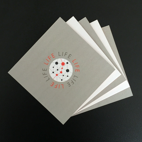
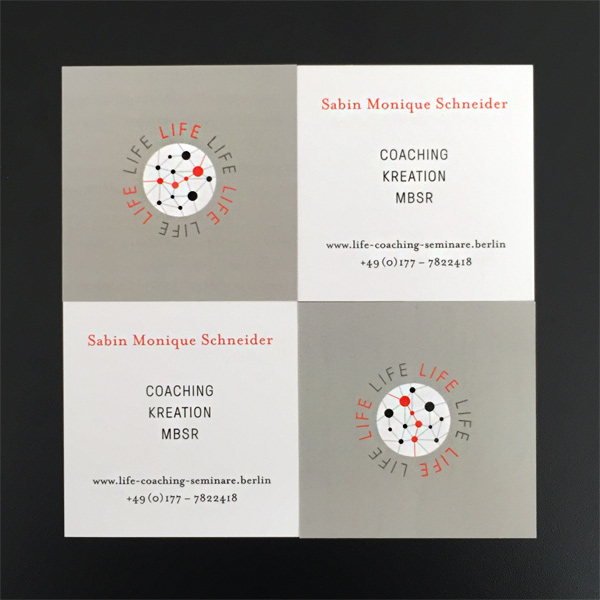
Frisch vom Drucker: Die neuen Visitenkarten für Sabin Monique Schneider
![]()
Frisch vom Drucker: Die neuen Visitenkarten für Sabin Monique Schneider
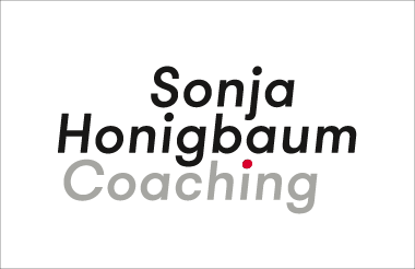
Für den Business Coach Sonja Honigbaum konzipierte ich eine Dynamic Brand Strategy mit dynamischer Wortmarke.
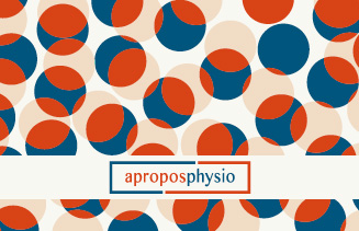
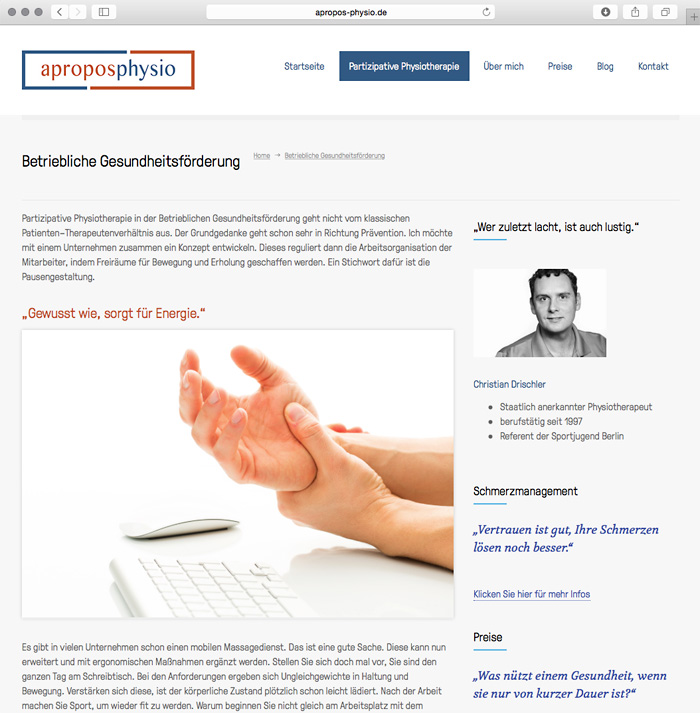
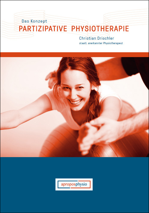
Für die Marke apropos-physio und das Modell “Partizipative Physiotherapie” entwickelte ich die Markenstrategie mit entsprechender Corporate Identiy. Die Kommunikation erfolgt über Visitenkarten, Infobroschüre und Website-Patienten-Portal.
ETWAS ABSTAND BRAUCHEN“ – dann kommen Sie doch ab 13.07. 2015 ins A.o.C. (Atelier of Creation). Das A.o.C. ist der neue Treffpunkt in Berlin-Mitte für all diejenigen, die kreative Impulse für ihr Leben suchen. Für die Seminarreihe „KUNST KOMMT VON KENNEN“ habe ich diesen Werbebanner / Flyer entwickelt.

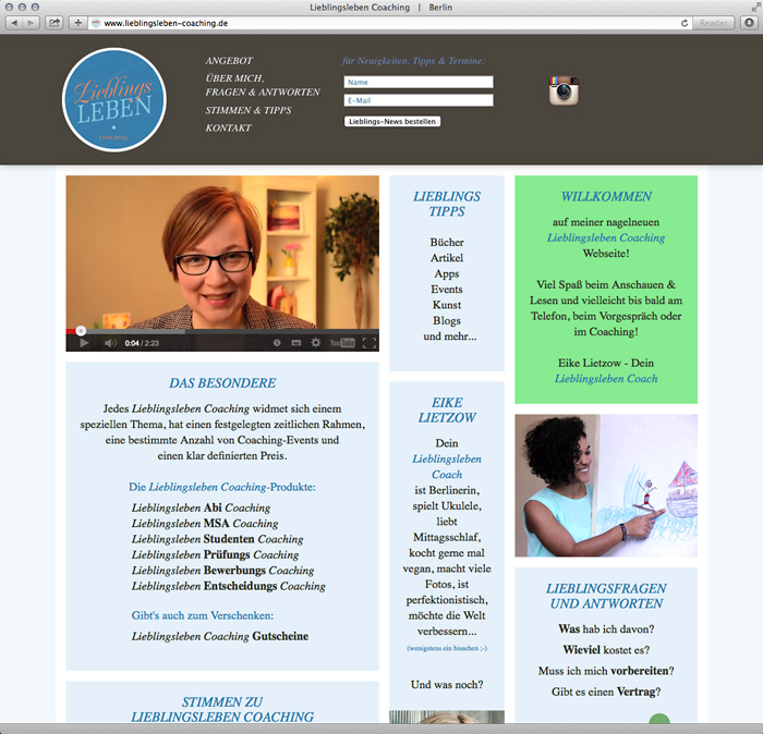
Ästhetik als Stimulanz für den Dialog – Eine Designstrategie für Lieblingsleben-Coaching®
Bedarfsanalyse und Strategieansatz:
Die 3 wichtigsten Kernwerte* in unserer Gesellschaft sind
• Gesundheit
• Freiheit
• Erfolg.
Deshalb besteht gerade bei jungen Menschen ein Bedürfnis nach Selbs Optimierung, mit dem Ziel, die eigene Leis tungsfähigkeit zu erkennen bzw. zu verbessern. Dabei bildet die Gesundheit die entscheidende Grundlage für die gelebte Freiheit und den Erfolg. *ermittelt im Werte-Index 2014 des renomierten Sozialforschnungsinstituts Trendbüro Wippermann.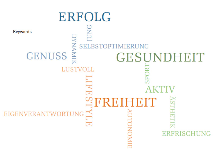
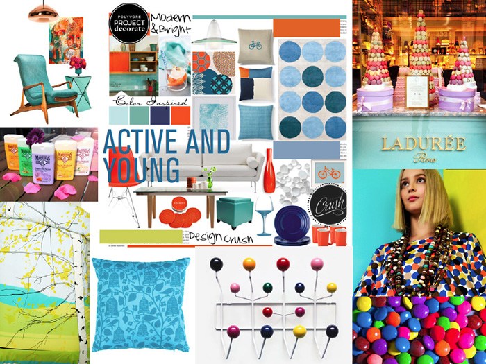
Moodboard:
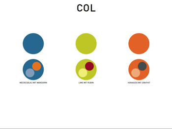
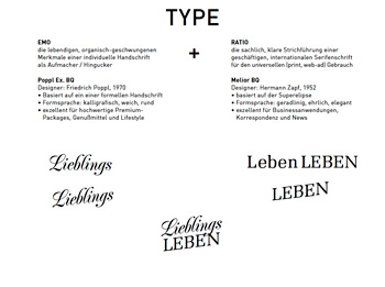
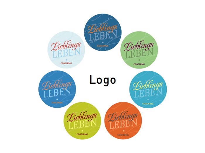
Final Logo
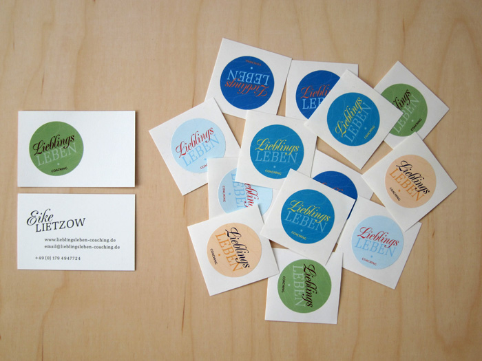
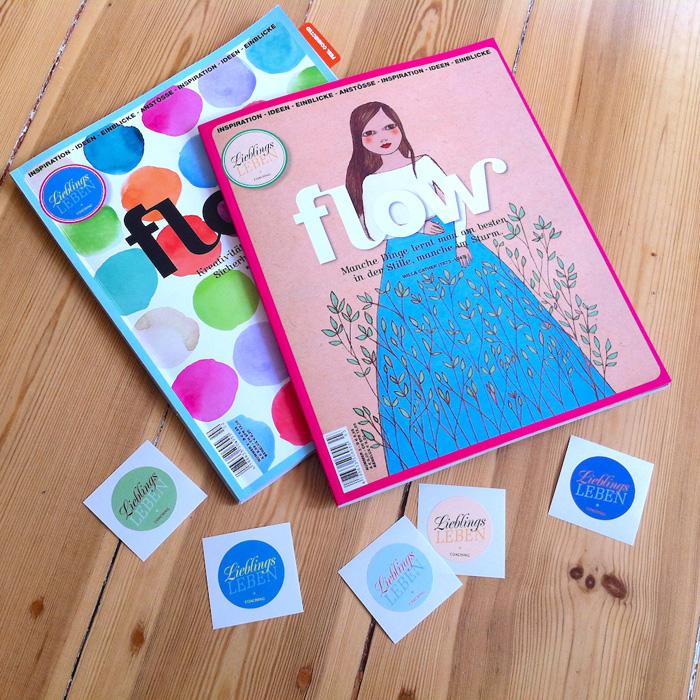
Business Card mit Logo-Stickern:
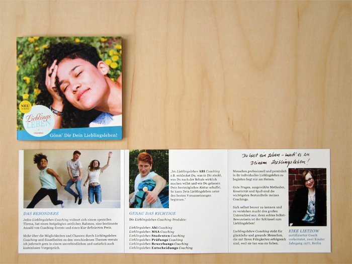
Kundenfolder:
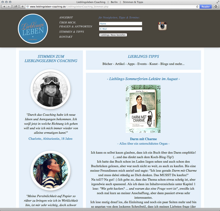
Konzeption und Design der Website: http://www.lieblingsleben-coaching.de

Logoentwurf für die Agentur NORDSÜD PR aus Berlin. Die NORDSÜD PR ist spezialisiert auf die Organisation des Kulturtranfers für Unternehmen von Nord- nach Süddeutschland.
der Welt ist jetzt Christian Drischler. Er startet in die Selbstständigkeit vielen neuen Ideen und einem frischen Corporate Design (Keyviuals und Klappvisitenkarten) aus dem Hause RUND.


Konzeption und Gestaltung einer crossmedialen Kommunikationskampagne für das KDW FESTIVAL im Stattbad. In dem Zusammenhang entwickelte ich die Kommunikationsmittel: Logo, Website www.kd-w.de, Facebook-Seite, Flyer


Corporate Identity für die neue OSLO Kaffebar am Berliner Nordbahnhof.
1. Draft: CRAFTMANSSHIP > shows the making of oslo coffee


–––––––––––––––––––––––––––––––––––––––––––––––––––––––––––––––
2. Draft: COSY > shows the emotional feeling of oslo coffee


–––––––––––––––––––––––––––––––––––––––––––––––––––––––––––––––
3. Draft: BOONE > shows joy of OSLO Kaffebar